


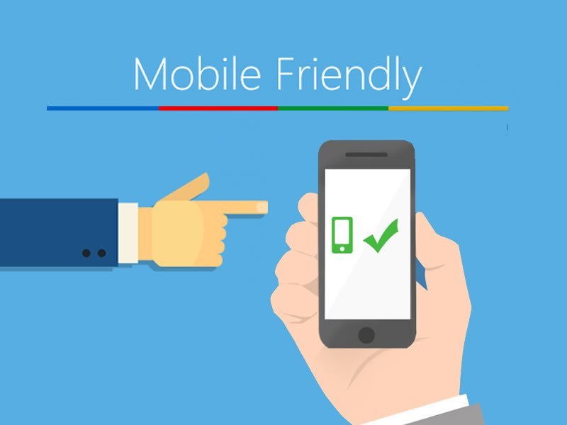
Consumers these days spend an average of 87 hours per month on their smartphones so it is important to make a site as mobile-friendly as possible. Mobile websites and mobile apps can look very similar at first-glance, and determining which is most suited to your needs will depend upon a number of factors, including target audiences, available budget, intended purpose and required features.
Here are 10 simple ways to make your website mobile friendly:
- Use Media Queries
Media queries are a key part of most mobile-friendly sites. This allows you to ask a device what size it is, then directs the browser to display things following the set of CSS that you have set. - Use Frameworks Like Bootstrap
Bootstrap is a front-end framework designed to efficiently scale your web page to any device. Using frameworks like this saves you a lot of headache and time from having to code everything. - Don’t Disable The Submit Button
If a user attempts to submit a fie and the submission is interrupted as a result of incoming calls or network vulnerabilities, which closes the browser. The chances of users resubmitting the file are close to impossible. - Use A Responsive Theme
This ensures a high-quality display for your users. A responsive site is one that responds based on the device that they’re viewing on. - Use Percentages
Configure things like images to have a certain width on the page (typically 100%). This provides a consistent viewing experience and ensures each image offer as much impact as possible. - Focus on Simple Designs
Many mobile users are not comfortable with performing complex tasks. This applies to designs too as humans generally have short attention spans so keeping things simple and valuable stands a better chance. - Don’t Block Javascript, CSS or Image Files
Making your website universally compatible is most important of them all. It should be appearing on any device that people will be able to view on. The more specialized something is, the less likely your site will be compatible. - Optimize Image Size
Shrinking file sizes helps load the page faster, and generally contributes to a positive image of your site. - Don’t Use Flash
Generally, mobile devices do not support Flash. The reasons for this are less important than the reality – if your website is still relying on Flash, then it’s not going to display properly on any mobile device. - Use Standard Fonts
Custom, creative fonts can help a website look nice, but mobile users don’t want to be constantly prompted to download new fonts to their phone. Instead, it might even turn them away from your site due to such request!
For more details on ways to maintain a mobile-friendly website, read more here: 5 Secrets That Will Make Your Website Mobile


To design a good website, it is very important that you plan an effective strategy that helps you create an attractive and eye catchy website.


An app is developed to fulfill a particular purpose, so an app can live or die depending on the purpose.
But there are several other purposes that only your website can fulfill.
It is a sin when you consider that your mobile app will do for your users what your website does for them.
In a situation where your app is your product, you do need an app.
Just because mobile apps have worked for certain brands, does not mean that having a mobile app will work for you as well.People do not look for businesses on app store, they do it on their mobile browsers.
People will only go to the app store to actually download an app.


