


The world of wine is not just about the right grapes; it's also about the right presentation. The wine label design plays an integral role in conveying the essence of the wine and your brand. It's the tactile symphony that captures your customer's eyeballs and directs them to reach out for your bottle amidst a sea of competing brands.
Your wine label design is an open invitation to a potential sparkling conversation between the consumer and your wine. Its task is to encapsulate what lies within the bottle, captivating the senses even before the seal is broken. But, how do you create a label that refuses to blend, daring to stand out instead? This article explores innovative strategies that will help you turn your wine labels into a bold statement about the uniqueness of your wine and your brand.
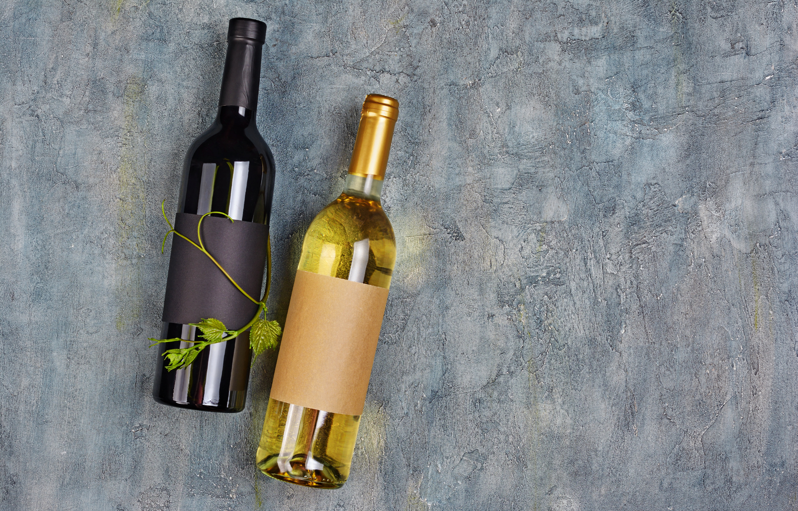
The Basics of Wine Label Design
Every bottle of wine embodies a unique story, a narrative of rich heritage or innovative venture, painted vividly through the canvas of a wine label. At the core, a well-crafted wine label design is a blend of essential information, aesthetic elements, and a dash of creativity, all cohesively tied together to speak the brand’s voice. To begin with, the basics of wine label design require you to incorporate certain mandatory details. These include elements like the brand name, wine variety, alcohol content, region of origin, and vintage year. Achieving a balance between these essentials and not cluttering your label ensures the communication of necessary information without overwhelming the viewer.
Yet, the realm of wine label design goes beyond just fulfilling the legal requirements. It's also about creating an emotional connection with the buyer. The choice of colours, typography, imagery, and the overall design helps convey your brand’s ethos and the distinct characteristics of the wine. Furthermore, the texture and quality of the paper used for the label, along with any finishes like embossing or foiling, contribute significantly to the sensory experience. These seemingly small details can lend a finesse to your design, adding a layer of sophistication and making your wine bottle feel premium in the hands of the customers.
Moreover, considering the bottle shape and size while designing your labels can help enhance the visual appeal. A design that's in harmony with the bottle can create an alluring silhouette that stands out on crowded shelves. Grasping the basics of wine label design is the stepping stone towards creating a captivating visual identity for your wine, an identity that doesn't just inform, but also engages, entices, and elevates the wine-drinking experience for your customers right from the moment they lay eyes on the bottle.
The Craft of Storytelling on a Bottle
The journey of every bottle of wine is an epic tale, from nurturing vines in picturesque vineyards to the careful blending of flavours in the winery. As a wine producer, translating this journey and your brand's values onto a label can create a powerful connection with your audience. It gives your wine a voice, a unique personality that resonates with the consumer beyond the quality of the beverage inside.
Crafting an engaging narrative on a bottle involves the subtle art of incorporating your brand's story into the wine label design. Begin by illuminating the roots of your vineyard and the passion that fuels your wine production. Was the vineyard passed down through generations? Maybe it was a dream set in the heart of a wine lover. Every story starts somewhere, and yours has the power to captivate the customer's attention in an intimate and visceral way.
Consider the relevant aspects of your wine's character you want to convey. For some, it might be the traditional wine-making methods handed down through generations, for others, it might be the innovative, scientific approach to creating unique blends. Reflect these aspects in your label design, using symbols, illustrations, colours, and text that resonate with your brand's ethos. Choosing to weave a tale about the distinct characteristics of the wine can also add a layer of intrigue. Dissect the notes of flavours and scents, the ageing process, and the influences of the terroir that sets your wine apart. These detailed depictions can stir a sense of anticipation and desire among consumers, guiding them on a sensory journey, even before the cork is popped.
Finally, use an engaging and emotive language style to bring your story to life. Striking the right tone that aligns with your brand image is vital. It could range from formal and sophisticated to friendly and conversational, depending on the demographic you are targeting. Remember, storytelling on a bottle is not about overwhelming the consumer with a flood of words. Instead, it's about skillfully using design elements and concise language to create an emotional tether, transforming each bottle of wine into a personal conversation with the consumer. Harness this powerful craft, and your wine will express a compelling tale that lingers long after the bottle is empty.
Choosing the Right Colors for Your Label
In the visually abundant world of wine, colours wield an incredible power. They speak in a silent language, kindling emotions and conveying messages subtly yet effectively. When it comes to wine label design, the correct use of colours can not only enhance aesthetic appeal but also resonate deeply with your target audience, nudging them closer to picking your bottle from the shelf.
Choosing the right colours for your wine label is a nuanced process. It's important to understand that different colours evoke different psychological responses. Reds, for instance, can stir passion and intensity, whereas blues can evoke feelings of tranquility and trust. Yellows and oranges are often associated with warmth and joy, while greens are linked to nature and freshness. Carefully choosing colours that align with your brand's personality and the wine's characteristics can create a powerful impact.
Consider the variety and style of your wine while choosing colours. A bold, full-bodied red might benefit from a label with rich, intense hues, while a light, crisp white might be best represented with cooler or more muted colours. The colour scheme can also be indicative of the flavour profile, hinting at the wine's taste even before the bottle is opened.
Keep in mind the culture and expectations of your target audience. While a younger, more adventurous demographic might appreciate unconventional, vibrant colours, a traditional audience might lean more towards classic, understated tones. Furthermore, taking into consideration cultural colour associations can help elicit the desired response, particularly in international markets.
In the end, consistency is key. Ensure that your chosen colour palette stays consistent across all your wines representing a single brand. This helps solidify your brand identity and aids in brand recognition. Balancing artistic creativity with thoughtful strategy, the colour code for wine labels is, indeed, a fascinating domain. The right fusion of colours could transform your bottle into a silent salesman, its label whispering to the customers, echoing your brand's essence and enticing them to discover the story behind your wine.

Making Typography Work for You
Emerging above the clamour of crowded wine shelves, your bottle needs to communicate clearly, standing as a testament to your brand's identity. This is where the subtle science and delicate art of typography come into the picture. Chosen thoughtfully, the fonts and formats used in your wine label design can evoke emotions, infer quality, and hint at the style of your wine, all while ensuring the necessary information is easy to read and connect with.
Fonts, in their varied forms and styles, carry distinct personalities. For instance, serif fonts tend to convey a sense of tradition, authority, and reliability, making them popular choices for winemakers with a long-established history or those producing premium wines. In contrast, sans-serif fonts, with their clean, modern lines, are ideal for contemporary wine brands seeking a minimalistic, chic look.
Script or handwritten fonts add a touch of elegance and personal appeal, often suitable for boutique wineries and limited-edition wines. Meanwhile, decorative or themed fonts can help convey the unique essence or the “quirkiness” of your brand. The key lies in matching your font style to the personality of your wine and your brand.
Consider readability in your format choices. The essential information on your wine label, such as the brand name, wine variety, and alcohol content, should be easily discernible. Try different arrangements, alignments, and sizing until you strike the balance between creativity and clarity. Don't shy away from the power of white space either. Having a generous field of unoccupied space around typography can actually help focus viewers' attention on the words. It can create a clean, uncluttered design that appeals to the eye and eases readability.
Also, remember that typography isn't just about the characters you choose; it includes the use of symbols, the addition of texture or shadow, and even the manipulation of letters' shapes and placements to create unique visual effects. The exploration of fonts and formats, and the interplay between them, is an exciting part of wine label design. Well-chosen types can intriguingly whisper your brand's story, lure the prospective buyer closer, and become a vital thread in the fabric of your brand’s visual identity. Use the power of typography to capture both the eyes and the imagination of your audience.
A New Trend in Wine Label Design
They say laughter is the shortest distance between two people. In the world of wine, interestingly, humour and creativity are increasingly bridging the gap between brands and consumers. This daring designing strategy is breaking the mould of traditional wine labels, offering a fresh, appealing, and memorable approach that can resonate with many modern consumers. Today's consumers, particularly the younger demographic, appreciate brands that don't take themselves too seriously. They engage more with products that mirror their sense of whimsy, fun, and novelty. Humorous or creatively distinct wine labels can captivate these consumers, breaking down the potentially intimidating air surrounding wine and making it more approachable.
Incorporating humour into wine label design doesn't mean making a mockery of your product. It's about cleverly crafted puns, witty wine-related jokes or quotes, funny illustrations, or playfully absurd imagery. This route requires a sense of lightheartedness but needs to be executed with elegant style. However, humour is entirely subjective, so understanding your target audience is crucial in this process. What tickles the fancy of one demographic might not resonate with another. It's important to conduct thorough research and perhaps even conduct some focus group testing to ensure your humour hits home and doesn't alienate potential buyers.
Creativity, on the other hand, encompasses endless arenas, from the unconventional use of colours, fonts, and graphics to using bizarre imagery or unique shapes and textures. Positioning yourself away from the norm, while still conveying your brand's message and the essence of the wine within, can create a visually stunning impact. Both humour and creativity, in the realm of wine label design, are bold strokes that need to be handled with care. When done right, they can carve out a distinctive niche for your wine, setting your brand apart in a sea of more conventional labels. More than just entertaining or intriguing the customer, these elements can foster a connection, igniting conversations around your wine, and helping it become a memorable part of social gatherings and wine-drinking occasions.
The Future of Wine Label Design
The world of wine is undergoing a transformation, championing personal connections and unique experiences. At the heart of this change is one engaging trend - the ascendance of personalised wine labels. Adding a touch of exclusivity and a profound branding opportunity, personalised labels are set to redefine the landscape of wine label design.
Imagine your bottle of wine transforming into a canvas that mirrors the patron's story, their memorable occasion, or their personal brand. Personalised wine labels allow consumers to elevate their wine-drinking experience, transforming it from a mere beverage choice to an individualised celebration. The labels can carry the customer's name, a specific date of importance, a personalised note or message, or even custom illustrations, ensuring each bottle holds a unique meaning.
From a branding perspective, offering personalised labels opens a gateway to a deeper engagement with your audience. It allows your brand to intertwine with the personal stories of your consumers. Consequently, a single bottle of wine transcends into a memorable keepsake, a memento of a special moment captured by the charm of personalised wine. Furthermore, personalised wine labels are not just for individual customers. Businesses, too, are leveraging this trend for corporate gifting, client appreciation, or branding at company events. A wine bottle adorned with a brand's logo and message is a testament to their taste, conveying a level of thought and sophistication in their business interactions.

Navigating the trend of personalised wine labels requires careful planning. From quality printing to maintaining a degree of standard branding, each aspect needs to be addressed thoughtfully. Moreover, setting up a smooth process for customers to personalise their labels, online or offline, is crucial to enhance user experience. Offering personalised wine labels is about embracing a future where products celebrate individual stories and unique experiences. As tools of deepening consumer engagement and enhancing brand recall, these labels are a promising avenue for wine brands to explore, marking an exciting chapter in the future of wine label design.
In the vineyard of competition, the art and strategy of wine label design play key roles in cultivating brand presence and aesthetic appeal. Crafting a wine label that stands out is a journey that blends storytelling, the right mix of colours and typography, and a sprinkle of creativity or even humour. It's about grasping the pulse of your target audience, aligning with the changing trends, and ultimately presenting your unique brand story that echoes through the aisles and invites the customer to explore the world within your bottle. If this journey seems daunting, fear not. Contact the team at Wine Design, where their expertise in custom wine label design will guide you through each step, helping you craft a distinct and engaging bottle that refuses to get lost in the crowd. Dare to stand out, bold and splendid, with Wine Design. Let's create that unforgettable wine label together!


Welcome : wyhnez.comRosé is just a mix of red wine with white wine?
Nahhhh.It’s all about skin contact.
Sounds good?Let us explain quickly before we get to the real fun part.All juice that runs out of grapes when you mash them is clear.The colour of wine comes from the juice’s contact with the skin of the grapes.Letting the juice and the skin soak together gives the wine its yellow, red or rosé colour.
So a rosé wine is created by juicing red grapes and then let the juice soak just for a very short time with the grape skins.
Let's get to the next one.Skouras – Peblo Rosé, our summer fling.Fun wine 101 - Rosé WineThis amazing dry Rosé moves you right into this fantastic summer holiday feeling.
Well, let’s see…so many good wines out there.Tell us a little about yourself and your businessPanagiotis: wyhnez wants to be your wine dealer!

If you know somebody who adores wine, you already know that drinking accessories make great gifts.
Wine holders look great on the counter, offering an easy and intriguing way to display a favorite bottle of wine.
They are also fantastic for the holidays.For more details, please visit at https://bigfootsuperstore.com/product/wine-bottle-holder/

Wine storage is the best way to keep wine fine without a lot spending.
So, if you want to buy a wine cooler- you can reach out to ChillingWine.
It is the most potent way of storing wine at a suitable temperature.

Chastity Valdes is an American wine blogger when she's not traveling the world on business, she publishes one of the least pretentious blogs on the Web.
It's wise and outspoken, as in a post about the state of wine tasting today.
Many wine blogs are the passionate side project of a wine enthusiast just crazy enough to spend their days off.
As I explore the ever-expanding wine universe, I make it a point to share my discoveries and express my opinions, primarily through my wine blog.


