


Sadly, UX Dark Patterns can be found all across the web. The surprising thing is that deceitful UX practices are not restricted to junk sites or sites with low traffic. Several notorious companies engage in misleading design.
We know that UX dark patterns harm users’ experience and perception of a brand. And, in some cases, they may even lead users to make financial decisions by mistake.
But, did you know that UX dark patterns are bad for SEO too?
In this post, we’ll explore:
- What UX dark patterns are
- Why UX dark patterns can hurt your SEO
- Some UX dark pattern examples & how they impact SEO
- Alternative design practices that get actual results
Ready? Let’s dive in!
What Are UX Dark Patterns?
Basically, UX dark patterns (also known as anti-patterns) are deceptive UX/UI interactions designed to trick users into doing something they wouldn’t normally do. The term gained notoriety in the 2010s, amidst the boom of the e-commerce sector.
Back then, in order to generate more sales and achieve marketing & revenue goals, many designers built deceptive interfaces that manipulated users. These interfaces made it seem like users had no choice but to spend more money on the brand, subscribe to a newsletter, or engage with an ad, among other actions.
Indeed, deception may work for a while, but as you may already know, UX dark patterns’ success is always short-lived. And they significantly harm how users perceive a brand.
But, what do we mean when we say that dark patterns harm SEO? Let’s dive a little deeper.
How Can UX Dark Patterns Harm Your SEO?
In short, UX dark patterns harm SEO because they:
- Decrease the quality of the user experience
- Damage your brand’s reputation
It’s a fact that user experience affects SEO. Indeed, every Google update shows us that SEO’s future lies in UX.
There’s tons of evidence that that’s the case. But here’s a tiny sample:
- Site speed has been a ranking factor for years (and the greatest selling point of Google’s AMP pages)
- Recently, Google began polling users to ask how easy or hard it was to find the answers they were looking for on a website after they returned to the search result page
- Google Search Central’s spam policies advise against activities that directly harm the user experience
Google’s business model relies on providing users with a curated selection of the best content the internet has to offer. The first 10 search results should be incredibly valuable information that helps users achieve their goals.
Google’s algorithm uses thousands of criteria to evaluate which websites meet this standard. Three of the most important ones are:
- Time-on-page — how much time the average user spends on a website
- Bounce rates — the percentage of users that leave a URL without meaningful interactions
- Backlinks — how many third-party websites link to that domain & their average quality
Websites using UX dark patterns are likely to underperform in these three aspects. Frustrated users will leave early, decreasing time-on-page and increasing bounce rates. And reputable websites will refuse to associate their brand with a platform that deceives its users.
Additionally, UX dark patterns could lead your users to review your brand negatively on public platforms. These reviews may not affect how your content’s positioned on the SERPs (search engine result pages). But they’ll surely pop up when users search your brand name.
Some companies orchestrate review bombing against their competitors. But, if you implement UX dark patterns, you could be inflicting severe brand damage on yourself.
Common Dark Patterns Examples + Their Impact on SEO
In this section, we’ll go over the 8 most common dark pattern examples, and how they may affect your website’s SEO. For a closer look into UX dark patterns (and their general implications), you can check this post by Danny Sapio.
In this section, we’ll cover:
- Forced continuity
- Confirmshaming
- Bait and switch
- Roach motel
- Obscure pricing
- Misdirections
- Sneaking into the basket
Forced Continuity
Forced continuity makes it obligatory for a user to engage with a brand in a certain way. One of the most popular and sneakiest ways to force continuity is by requesting a credit card for a free trial and auto-charging the user without confirmation.
This dark pattern doesn’t usually hurt a website’s SEO. In fact, most subscription services engage in it. But, in some cases, forced continuity will harm your users’ perception of your brand, which could lead to:
- Lower time-on-page
- Negative SEO & bad reviews
Confirmshaming
Confirmshaming is one of the most common dark UX patterns. You get an option you don’t want, but the alternative is labeled as some kind of embarrassing move. For example: “No thanks, I don’t like to save money”.
What can a user that doesn’t want to engage do?
- Option a: Accept the shameful alternative
- Option b: Leave your website
Using this type of dark pattern can be particularly harmful if you’re presenting this offensive choice to a new user. This mistake is common for newsletter sign-up popups, and it can:
- Increase your bounce rates
- Decrease your time-on-page
Bait and Switch
Windows used this type of UX dark pattern in 2016. In a pop-up window, clicking the X (to close the window) would initiate an update.
Like forced continuity, this dark pattern could negatively impact your website’s reputation.
Roach Motel
Roach Motel is one of those dark UX patterns that let you do something easily (such as sign up for an account) but makes it extremely difficult for you to get out of the situation.
Like confirmshaming, Roach Motel is usually used in email marketing. While confirmshaming humiliates users who may not want to subscribe to a newsletter, roach motel prevents them from disengaging (unsubscribing) when they want to.
Preventing Price Comparisons
Vague or inaccessible pricing information is also a UX dark pattern.
Not giving users proper pricing information means preventing them from being in control of their journey. This is extremely common among UX dark patterns: They are about forcing the user to make decisions they may not fully consent to, and preventing them from fully taking charge of their experience.
This dark pattern won’t directly harm your SEO. However, it may:
- Lead to negative SEO & bad reviews
- Harm your brand perception
- Hurt your conversion rate
Misdirection
These dark UI patterns are designed to focus your attention on one thing so that you’ll overlook what you’re really looking for. Amazon Prime membership cancellation, for instance, takes you to a page with information about its benefits.
This type of dark pattern can be particularly harmful to SEO if instead of providing the information a user expects to find on a URL, you offer them a transactional opportunity that doesn’t match their search intent.
Consequently, users will not engage with your content significantly, leading to:
- Low time-on-page
- High bounce rates
- Low rankings
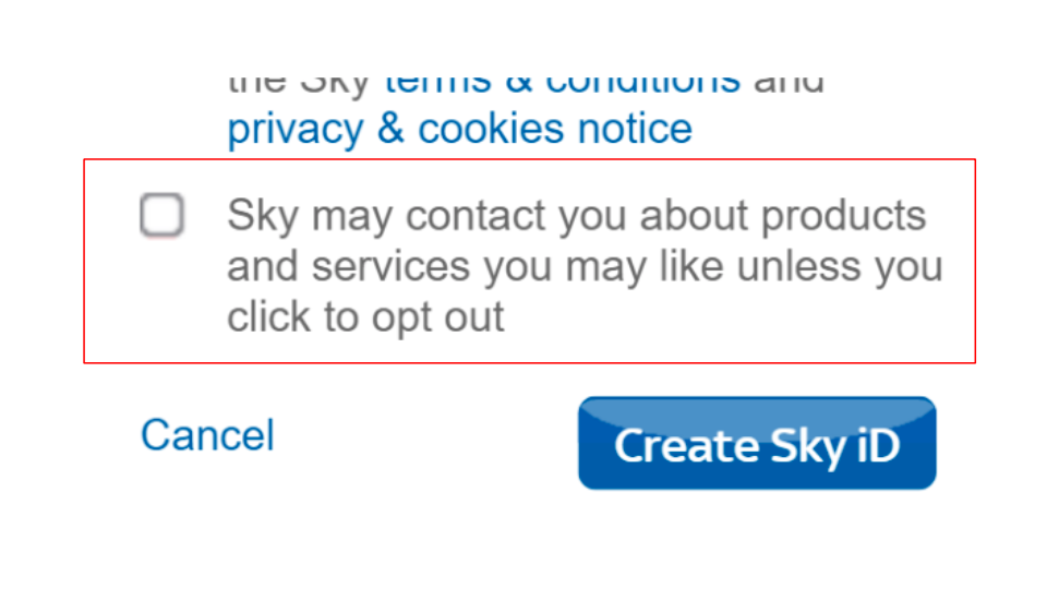
Trick questions
This obscure pattern tricks users into answering a question in a way they didn’t intend. Similarly to Confirmshaming, trick questions are often presented to users when they’re offered two different options. One involves engaging and the other one revokes consent.
With trick questions, the option that the brand wants users to pick and the undesirable option are worded in a way that sounds confusing.
Trick questions may not be structured as questions. For instance, a check input may act as a trick question. Users assume that by checking, they’re affirming something. So, it’s easy to structure this type of input in a deceitful way.
Here’s an example:
Sneaking into the basket
This UX dark pattern automatically introduces an additional item into the user’s shopping cart. Like most dark patterns, “sneaking into the basket” capitalizes on users trusting a platform and not paying too much attention.
And, like most of these dark patterns, it’s likely to cause brand damage.
UX and SEO: There’s a Better Way
Dark UX patterns won’t get you anywhere. But, how can you increase your website’s performance in a whitehat way?
Implementing dark patterns may make sense to you if you run a small website with little traffic. If few people visit your website, you probably want to get the most out of every visitor. So, you begin implementing dark patterns.
But, there’s a bigger problem there: Low organic traffic. Reverting that problem will be a challenge. But it’ll be extremely rewarding.
Wondering how which changes to make first?
We recommend you:
- Prioritize page speed
- Prevent 404s (and design your fallback pages strategically)
- Take responsivity seriously
- Use user-centric lead capture tools
- Implement Google’s HEART Framework
Let’s dive in!
Prioritize Page Speed
Slow-loading pages are almost as frustrating to users as UX dark patterns. In fact, a one-second delay in mobile loading speed can impact conversion rates by up to 20%.
If you want to optimize your website for conversions, make it fast. Especially on mobile.
Here are some tips to get started:
- Use next-gen image formats such as WebP
- Adopt an efficient policy for loading CSS & JS
Prevent 404s (& Design Your Fallback Pages)
It’s always wise to go out of your way to prevent 404s.
We recommend:
- Staying on top of your website’s structure, to be able to quickly detect new 404s
- Setting permanent redirects for unavailable content
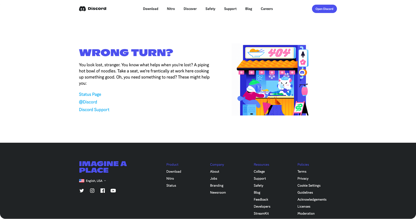
Discord’s 404 page
Additionally, make sure that when your users land on a 404, they have a positive experience.
Consider:
- Infusing some personality into your 404s
- Adding a CTA that helps users get back on track (Go back to the homepage, for instance)
Be Truly Responsive
Responsivity isn’t just about adapting a website’s font size to fit in a mobile device. True responsivity involves tweaking your website to deliver a high-quality experience across devices.
For instance, aside from adjusting sizing, you may want to:
- Make sure your website’s animations & interactions work across devices
- Simplify or remove those elements that slow down the user experience on mobile devices
Use User-Centric Lead Capture Tools
It’s okay to optimize a website for conversions. In fact, conversion web design is a discipline of its own, and it makes a difference to businesses.
However, conversion designers don’t just try to force users to convert. Instead, they shape conversion mechanisms so users can engage frictionlessly and genuinely, when it makes sense for them.
Instead of relying on forced continuity or deceitful offerings, map out your user journey and design better ways to engage.
For instance, don’t try to get users to sign up to your newsletter as soon as they enter your home page. If you will use sign-up popups, trigger them when the user has expressed true interest in your content.
Implement Google’s HEART Framework
Xin Fu, Hilary Hutchinson & Kerry Rodden at Google designed a framework to evaluate the user experience of web applications.
The HEART framework is extremely user-centered and scalable. And it owes its name to its 5 evaluation criteria:
- Happiness
- Engagement
- Adoption
- Retention
- Task Success
These 5 criteria are evaluated across:
- Goals
- Signals
- Metrics
The framework can be a good starting point for optimizing your platform. And its original paper is so concise that it’s worth reading in its entirety.
Key Takeaways
Throughout this guide, we explained what dark UX patterns are and how they can cause severe SEO problems.
Large companies “get away” with implementing UX dark patterns, with minimal brand damage. But, if you’re a newcomer, the poor perception & low user engagement caused by dark patterns isn’t something you can afford.
Today, creating a healthier web environment requires a shift towards more trustworthy and safe practices. And, at the end of the day, an honest design approach pays off.
Put users in control of their experience, and you’ll be perceived as a trustworthy source, get qualified recurring traffic, and climb up in the SERPs.
----
Also seen on UX Collective’s Bootcamp.


Infestus Consulting is a search engine optimization company based in Atlanta, but we offer comprehensive search engine marketing and digital marketing services to businesses everywhere.
View our SEO services for Atlanta, including on-page, consulting, inbound marketing, and more.
We are best SEO company in Atlanta, providing search engine optimization, internet marketing, website development.
We give you a comprehensive selection of professional SEO services to get your business more visibility in search results using only white hat SEO techniques.
Call for your website review today.


It is not surprising that companies around the world, the size of Nike, CocaCola, Google, and Apple, worry so much about this aspect in their products and services.
In other words, good user experience can help generate more sales opportunities and close more businesses.
Now, have you ever visited confusing websites that did not communicate the value proposition or that made it difficult to find the necessary information and what you were looking for?
Well, then you’ve been in the presence of examples of a poorly crafted UI.
Keep that in your mind because now we will tell you that the UI directly affects the UX since if your site navigation is bad, it is quite difficult to provide a good experience.
It is capable of making this experience even more enjoyable if the designer manages to eliminate some stages in the process of using the product, which means fewer screens to interact.

Digital marketing is one the quickest way to reach the customers and prospective customers.
To promote business online, digital marketing service becomes one of the best platforms in these days.
People can reach to maximum target audience.
SEO experts from digital marketing services Birmingham always provide SEO, Pay per Click, Inbound Marketing or Email Marketing .They never compromise with service quality.
People always look for positive result oriented services.SEO experts from Birmingham always meet their expectations.
They are available for 24x7 hours.

MEZ BİLİŞİM Dijital Ajans kullanıcı deneyimini ve dönüşümlerini geliştirmeye yardımcı olan en iyi özel SEO, web tasarım ve dijital pazarlama hizmetlerini sunmaktadır.


