There was a time when a well designed website can’t be described as a whole due to the absence of any key phrase. Instead people used to describe each feature and functionality individually. Then the key phrase of “User-Friendly” was introduced and made the whole explaining process simple. Now if a website is simple, sleek and responsive, we only need to say its “user-friendly” and rest is understood.
Now a lot more remarkable web design trends have emerged and this evolutionary process is not going to end soon. People are becoming more demanding when it comes to website design and development. If your website is poorly designed and offer poor user experience by having broken links, take too long to load, with complex navigation then your business is out of the game.
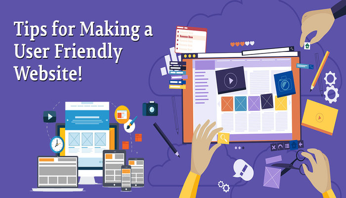
Having a responsive and user-friendly website is a must. Your website must offer a rich user experience to keep visitors engage for longer period of time. RE2QA have gathered a list of tips for building a user-friendly website which maximize the user experience.
Design for the User
Make sure that when you are designing a website, keep user in mind. Keep you website simple and as intuitive as possible.URL structure must be in user readable and understandable form. Each page must be named properly. Use proper navigation menu and if you have larger sitemap, use a secondary menu bar often seen on the top left or right side of the website.
Here are few tips highly recommended for designing a sleek user-friendly website:
Responsive and Mobile Friendly:
Today, users need to be able to browse through your website regardless of device restriction. Your website must be viewable on all kinds of screen sizes. User need to be able to navigate through your website by using desktop computer, laptop, mobile or tablet.
Simple Navigation:
Simplicity in design is not a new concept. It is an evergreen idea. Having a simple design with easy to user navigation panel, simple page names are things most loved by the users. So keep navigation and sub-navigation to a minimum when possible.
Easy to Find Brand Identity:
Every user expects to find your brand identity at the very first glance on your website. So do not push the visitor to hunt for your brand identity. Keep the logo at the obvious position where user is expecting it to appear and that place is on the top left side. Make it clickable and connect it to the home page so that whenever a visitor feel lost, he can come to home page by clicking the logo.
Loading Time:
If your website loading time is more than 3 seconds, you are going to lose visitors on regular basis. A recent study conducted by Google states that if a site take more than 3 seconds to load, you can lose 53% of the mobile site visits.
Search Feature:
Some time a user is unable to locate his desire product or information. They need a search feature to search the entire site with ease. If you do not have search feature on your website, visitor will leave and find a site which is easier to navigate.
Call-to-Action:
It is very obvious that you want a visitor to perform an action on your website. Why not remind the visitor to do so by adding a clear call to action on your website. A little reminder can do the magic. That reminder is a clear call to action which drives a visitor to take an action you want him to do. Here are some prominent examples of call to action.
- Get Your Free XYZ
- Get a Quote
- Click Here to Order
- Learn More About Us
- Contact Us
- Download Now
- Order Now
Easy To Understand Content:
Use language which is easy to understand and concise. Make sure your content is well written and properly formatted so that a visitor can easily skim through and understand. There is no problem in reflecting your level of expertise in the field but also keep in mind the level of your visitor. Too much use of industry jargon can confuse the visitor.
Text and Media:
It is very important to create or find the right balance between text and media. Now a days visitors are more keen to look at images or videos rather than reading text. Use high quality images and videos but do not over crowd your website. Keep in mind that search engines still love text more than images and videos which force you to keep the balance between text and media.
Shareable Content:
If possible use social media share icons on your website wherever and whenever possible. This will allow visitors to share your website content on their social media. This way your site can get the social coverage.
On Your Mark, Get Set, Go!
Now you are aware of the tips which can make your website “user-friendly” with rich user experience. You are all set to go. Make sure to test the functionality of the website before it goes live. A site with bugs or errors cannot be considered as user-friendly. You can check website loading speed with Google’s PageSpeed Insight.
Source: This content is the property of RE2QA which is a tech company based in United States. They provide Web designing & Development Services.


Recent research from Outsourcing Insight shows that approximately 71% of organizations prefer to outsource their web development projects.
Web development outsourcing brings a whole host of benefits, including cost-cutting, finding the right talent, fulfilling the client deadline, and improving business operations for the businesses.
But, as we see on the other side of the hiring website development company, there are some flaws or challenges faced by many organizations.
And the main reason behind this is the lack of research conducted or mistakes made by the businesses when it comes to hiring web development companies for their web design and development services.
Here’re some useful tips that can help you avoid blunders while choosing the web design and development company for your project.Get in touch with your network to find the referencesThe best place to start your hunt for a web development company is to initiate a quick survey within your network.
Probably, you can get in touch with your co-workers, colleagues, or marketing team to find the details about a suitable website development company.


Apponix stands at the top of best technical training providers in Hyderabad and many other cities.
100% career oriented training by expert trainers are the hallmark features of our institute.
We assist the students in professional level Resume and Interview preparation.https://www.apponix.com/web/Web-Designing-and-Development-Training-in-Hyderabad.html

If you wish to increase your business opportunities then you need to hire best web Development Company in Ludhiana.
We all know that professionally and attractive designed website is the most cost effective marketing tool available in the world today.
Due to advancement of internet, everyone need responsive website for creating a good online business setup.
Also, we used seo friendly content in website to rank on search engines.
Here at W3sols, we offer remarkable and quality web designing In Ludhiana at the best and cheapest prices.