


Are you planning to enter the digital trading world and about to build a website to bump-up brand awareness? Well, you can influence your audience with a stunning one-page website!
A one-pager website is perhaps the optimum choice for the ones that need to engage the audience with a fresh design that catches their attention at first glance. Easy to load to, hassle-free navigation and striking animations are enough to increase your conversion rate.
So, it won’t be a bad decision to build a website that contains your personal stuff or we can say a portfolio that depicts your work and experience. Some one-pager designs are optimum for marketing your services and products if you design your website precisely.
Here are some simple ways you can build an amazing one-page website for enhanced user experience.
# Analyze Your Actual Needs
A lot of people out there aren’t actually aware of their sole purpose of creating a website and all they want is to engage the audience. An adequate plan is the first step towards creating a website that can be utilized for numerous purposes.

Once your idea about the website is clear, it is time to focus on your targeted audience. Aspects like user expectations should be always on the top priority of a user. This simply implies that you can create a design that is specifically intended to target a specific group of audience.
Adequate placement of content, images, and media is another thing that shouldn’t be missed especially you aren’t emphasizing much on creating numerous pages for your services. This is the place where the concept of a one-pager website comes into place. Adequate utilization of white space and placement of content at the right place should be your biggest priority.
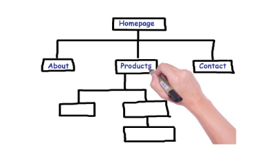
# Follow a Hierarchy
Building a one-pager website isn’t just about placing elements and content just one after other rather you need to direct the eyes of the audience towards the desired spot. As per the designing experts, you have to maintain a hierarchy in your website design. This means that the major elements should be placed on the top followed by the minor ones.
The focus of the visitor should be always emphasized and hence you need to design the website in a way that the main purpose is served regardless of the user’s navigation. This could be the best way to ensure user engagement that would surely decrease the bounce rate of your website.
Adequate fonts on the top of the website could be the best way to highlight your products or services in a one-pager website, which otherwise becomes quite challenging. You can refer to some of the websites that are built in the same way to get an idea about the type of fonts that you need to choose for the starting and the end of the website.
# Suitable and Clear Navigation
Navigation on a website with multiple pages is justified but you would be thinking the use of same on a one pager-website? Well, you cannot just build a one-pager website with poor or no navigation and expect huge client engagement. One needs to ensure that everything is simple yet engaging for the users especially if you are diverting them towards an external link.
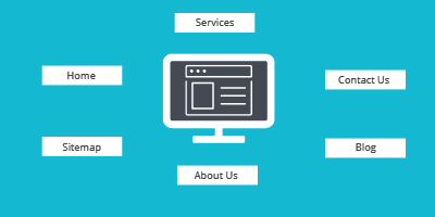
Since your website is one-pager, you should never forget to highlight the menu bar that can navigate the user to the right place of that particular static page. This is a crucial aspect that shouldn’t be missed while you are about to enhance your brand awareness.
There are people who repeat the mistake of not guiding the audience regarding the external links on their website. This could be quite confusing while you need to maintain a healthy traffic rate on your website. The audience should be aware of the links and the purpose of referring so that it doesn’t annoy them unnecessarily.
# Add Attractive Effects
A superior navigation effect whenever the user clicks on the menu bar to go downwards could be quite effective in leaving an impression on your users. Lot designers recommend the use of animations and effects that gives a classic touch to your one-pager website.
One can include some animation that depicts something related to their brand, which would be another way to put a great impression on the users. Furthermore, the thing that you shouldn’t miss is the choice of effects and animation, which shouldn’t be bulky enough to hamper the loading speed of the website.
The market is full of themes that you can just choose and include specific functionalities in your website. It is important for you to choose a website theme that offers the same functionality without affecting the overall performance of your website. Make sure you check the reviews and the ratings of any theme before you can pick it for your business website.
# Adequate Use of Images
What would be your first impression when you visit a website that isn’t loaded with images that depict their products and services? You probably won’t rely on that specific website, isn’t it?
Images on your website actually speak a lot about your brand. There is no point you can ignore the importance of alluring images on your one-pager website. Some high-quality images could be the game-changer for your business as these images put a great impact on your audience and simply builds trust over them.
Sometimes you prefer images that are already available over the internet and most of the people are familiar with them. You need to choose your own captured images rather than stock images that are eventually of no use. A great photo-shoot of your products could mesmerize the audience and can impact your revenues in many ways.
Furthermore, the content on your website looks more engaging and trustworthy when it is coupled with high-quality images. Hence, the next time you are planning to build a one-pager website for your business purpose, make sure you include some stunning images to augment the user experience.
Verdict
The above-mentioned ways could be quite helpful in building a one-pager website that could be attractive enough to bump-up your online trading.
Author Bio: Liza Kosh is a renowned blogger based in the USA who is associated with Seasia Infotech, a web development company as a senior content developer. She loves to share her views on her personal blogs as well and prefers diverse niches.


Having a well-built website is something were multiple factors including the latest technical wireframe, an eye-catching design with a user-friendly approach and a backend team with a quick turnaround team need to act coherently.
New feature rollouts often get queued and there will be continuous friction between the web development company and the customer and the same is the case with the website designing company in Dubai.
Hiring a website designing company in Dubai can be challenging.
For a company, its website is the frontend to its customers.
Delivering on time with top-notch quality is one of the most sought-after qualities of a web development company and this is applicable to the website design agency Dubai.
The stellar customer feedback on their work is a prime example of this.

Being a business owner always gets you overwhelmed on the thought of what it can take to get more customers to your website and what are those tactics that can fall into place and you achieve the targeted traffic to your website.
If you are also one of those a Web Designing Company in Bangalore can make you the first choice of your customers.Advertising:Advertising is a brilliant method of attracting visitors and building your image bringing about higher sales, with promoting strategies.Content Marketing: Content showcasing is a force to attract traffic to your website as engaging content makes your business incredibly popular widely.Social Media:Businesses today are utilizing online life to develop their organizations with the assistance of web-based social networking channels, for example, Facebook and Instagram picking up the exposure.Also, visit: https://www.webomindapps.com/web-application-development-company.html

It is one of Delhi's major satellite cities, with such a booming IT sector.
Website design companies having experienced IT trainees and professionals must be preferred.
Website design company in Faridabad that really can help you with your website requirements.
Web design is regarded as one of the most important aspects for speeding business growth; nevertheless, it is not just about setting up a website, but it is also about how well it is created.
Of course, this includes multilingual assistance, SEO strategies, and easy access to the latest updates.
"Website Designing " website designing company is a Pack of creative and easy-to-use Responsive web designs made by TECHTRA DIGITAL which you can create a professional site using a ready-to-use Template.Trust the website design company in FaridabadNowadays every business requires a web presence to reach international markets.


Now if a website is simple, sleek and responsive, we only need to say its “user-friendly” and rest is understood.Now a lot more remarkable web design trends have emerged and this evolutionary process is not going to end soon.
If your website is poorly designed and offer poor user experience by having broken links, take too long to load, with complex navigation then your business is out of the game.Having a responsive and user-friendly website is a must.
Your website must offer a rich user experience to keep visitors engage for longer period of time.
Use proper navigation menu and if you have larger sitemap, use a secondary menu bar often seen on the top left or right side of the website.Here are few tips highly recommended for designing a sleek user-friendly website:Responsive and Mobile Friendly:Today, users need to be able to browse through your website regardless of device restriction.
User need to be able to navigate through your website by using desktop computer, laptop, mobile or tablet.Simple Navigation:Simplicity in design is not a new concept.
Having a simple design with easy to user navigation panel, simple page names are things most loved by the users.


